Six Months. One mission
Newman’s Own Website Redesign
Role:
As the Lead UX Designer, I was responsible for all wireframes, visual and UI/UX design, prototyping and user testing. I also worked with cross-functional teams to guide develoment.
TEAM
1 Designer
1 Creative Director
1 Account Manager
1 Copywriter
2 Stakeholders
1 Legal Team
1 Development Team
TIMELINE:
6 Months
The
Challenge
company overview
Newman’s Own, Inc. (NOI) is a privately held consumer packaged goods company, founded by Oscar‐winning actor and director and championship race car driver Paul Newman.
100% of the profits goes to good causes through Newman’s Own Foundation (NOF). In total, more than $570 million has been donated to good causes since 1982.
PRIMARY PROBLEM/OBJECTIVE:
How might we redesign Newman’s Own Food website to sell more products while also communicating the clear connection between their philanthropy and the food brand?
The Solve
& Impact
Stakeholder Insights
I immediately sat down with key stakeholders to understand their goals and mission for the new sites. Three main themes continued to appear.
Poor Organization:
“We do not feature products in an engaging, appetizing way - it is very stale and dated”Poor Mission Connection
“We don’t clearly state the mission of the Newman’s Own brand”Poor User Experience
“We do not have a great navigation system for finding information”
Business Goals/
Success Metrics
Increase time on website
Drive traffic to sister philanthropic website
Increase customer engagment
Understanding Users and User Flows
After speaking to our shareholders and understanding their business goals and more importantly, their WHY for the redesign, it was time to understand our users and WHO I was designing for.
Users:
CURRENT USERS:
45+ years old
Senior singles and couples, established couples, empty nesters
Affluent: HH1 $100K+
80% white
Lives in prosperous cities and suburbs
PROSPECTIVE USERS
18-36 years old
Younger millennials/Gen Z
Household of 2-4 members
User Insights
Two clear themes emerged from our research: positive viewpoints and an unclear mission
POSITIVE VIEWPOINTS:
Overall customers had a positive view of the brand across current users
The brand is well respected across most customers
Loyal customer base
Most described as a feel-good brand
UNCLEAR MISSION:
However, there are issues with awareness, engagement and clarity of mission
Low awareness for millennial and gen z, not bringing in new customers
Low relevance for millennial and gen z who don’t know Paul Newman or his vision
Customers are not engaged with the brand
Persona: Meet Amanda, Our Inspirational, Prospective Design Target
Amanda is a 32‐year‐old virtual assistant and mom of one. She loves to hike and travel when she can. She loves great tasting food and enjoys cooking but loves brands and products that make cooking easier without sacrificing quality.
She loves discovering new products and gravitates toward brands that are purpose driven, authentic, transparent and making the world a better place.
AMANDA’S NEEDS:
Easily navigate through website to find products
Easily find dietary information about each product
Understand where to buy products
User Flows
Once we identified each website’s target audience, we dove into user flows to better understand their goals throughout the experience.
Redefine Goal and UX Approach
REDEFINED UX GOAL
To modernize the visual identity and brand touch points, making them more distinctive and relevant, and easier to communicate the greater brand mission to a broader audience.
UX APPROACH
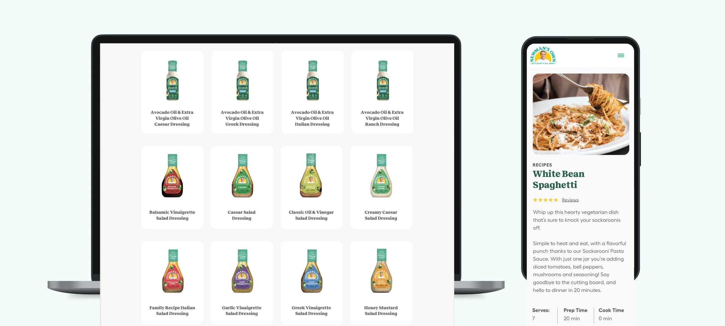
Regroup products to allow for easy discovery
New recipe presentations that include creative ties to the foundation and philanthropic efforts
Encourage more exploration of the foundation by adding mission and impact crosslinks on every page
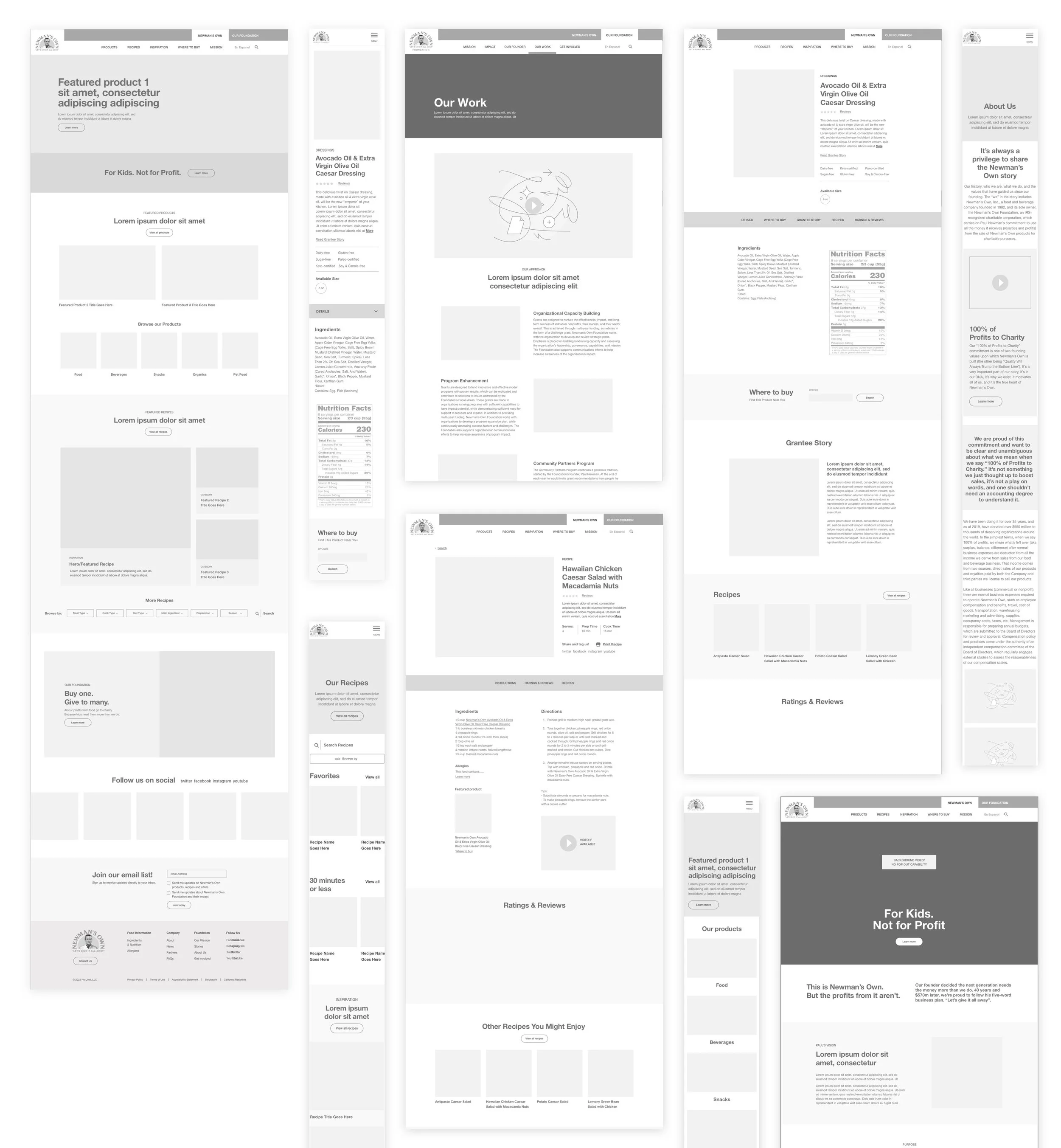
Wireframes
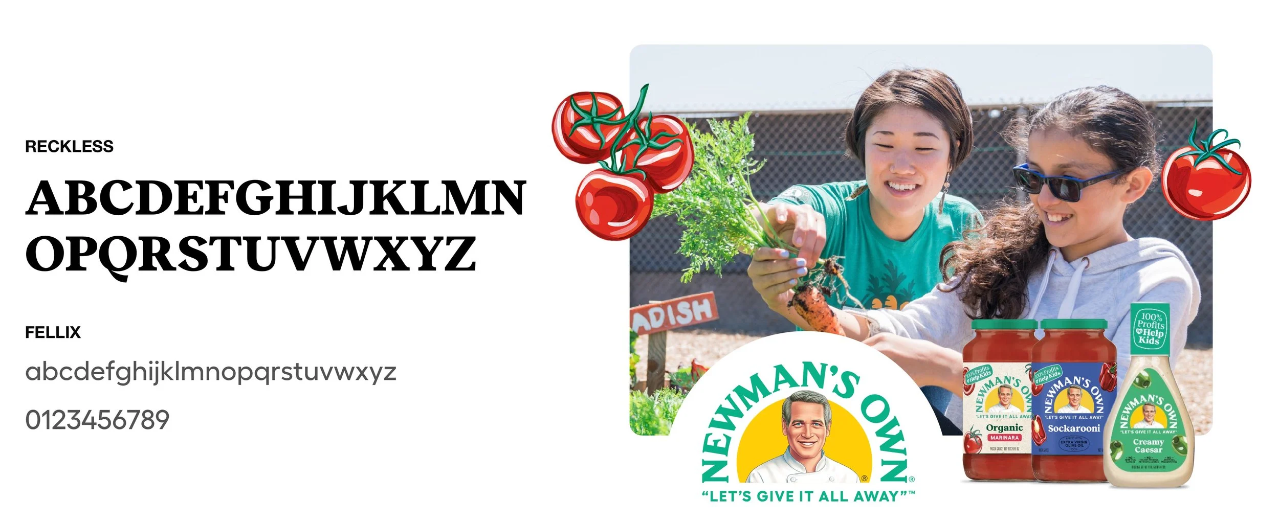
Style Guide
Design Challenge: Accessibility
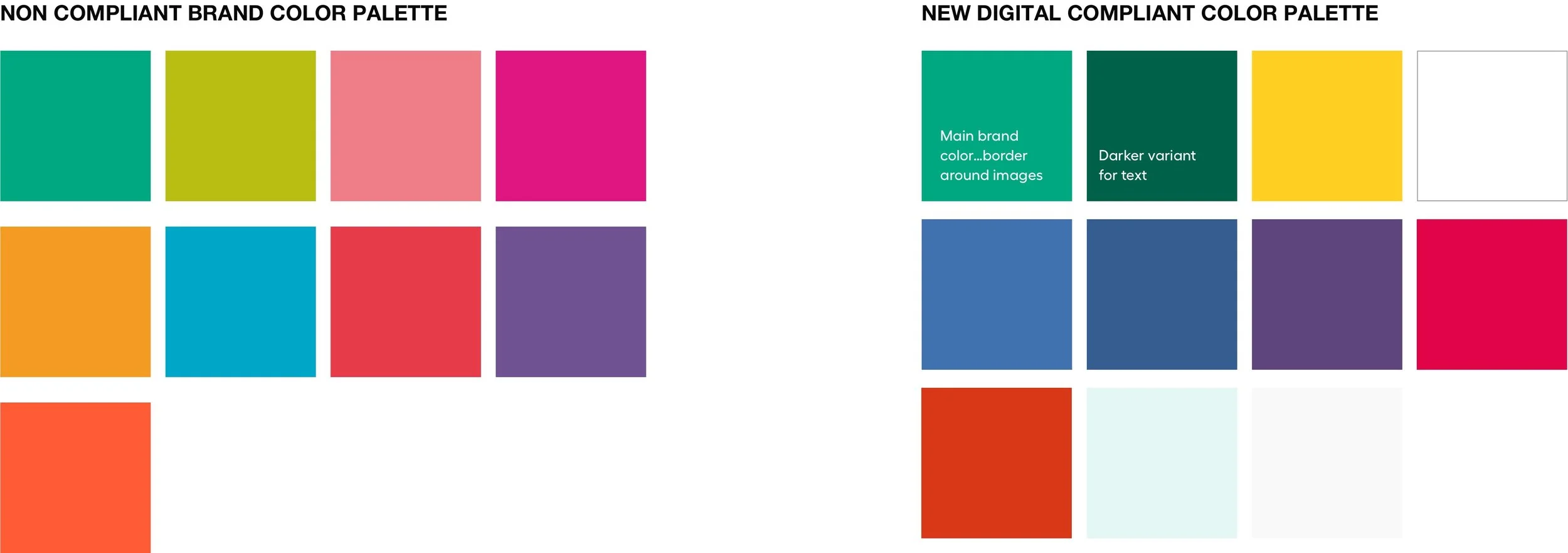
Immediately I recognized that the new brand colors were not going to pass accessibility tests. They simply were not high contrasting enough.
Initially, the client was not happy to learn that we could not use the color palette they paid so much money for. I developed a new compliant color palette and explained the importance of accessibility and was able to gather buy in.
Design Challenge: Allergy Page Mobile Considerations
A big feature the website had to have was a dedicated allergy page. This looked fine on desktop but was quite the challenge on mobile to ensure an easy user experience.
Was it easier for a user to scroll left and right, a ui paradigm that is widely accepted? Or was it was it easier for a user to scroll vertically?
After testing, I decided to go with scrolling vertically. While scrolling left and right was more aesthetically appealing, a user would have to do allot of scrolling to find each allergen. With vertically scrolling, a user is able to see all allergens at a quick glance for each product.
Visual Design
How might we redesign Newman’s Own Food and Foundation websites to sell more products while also communicating the clear connection between their philanthropy and the food brand?
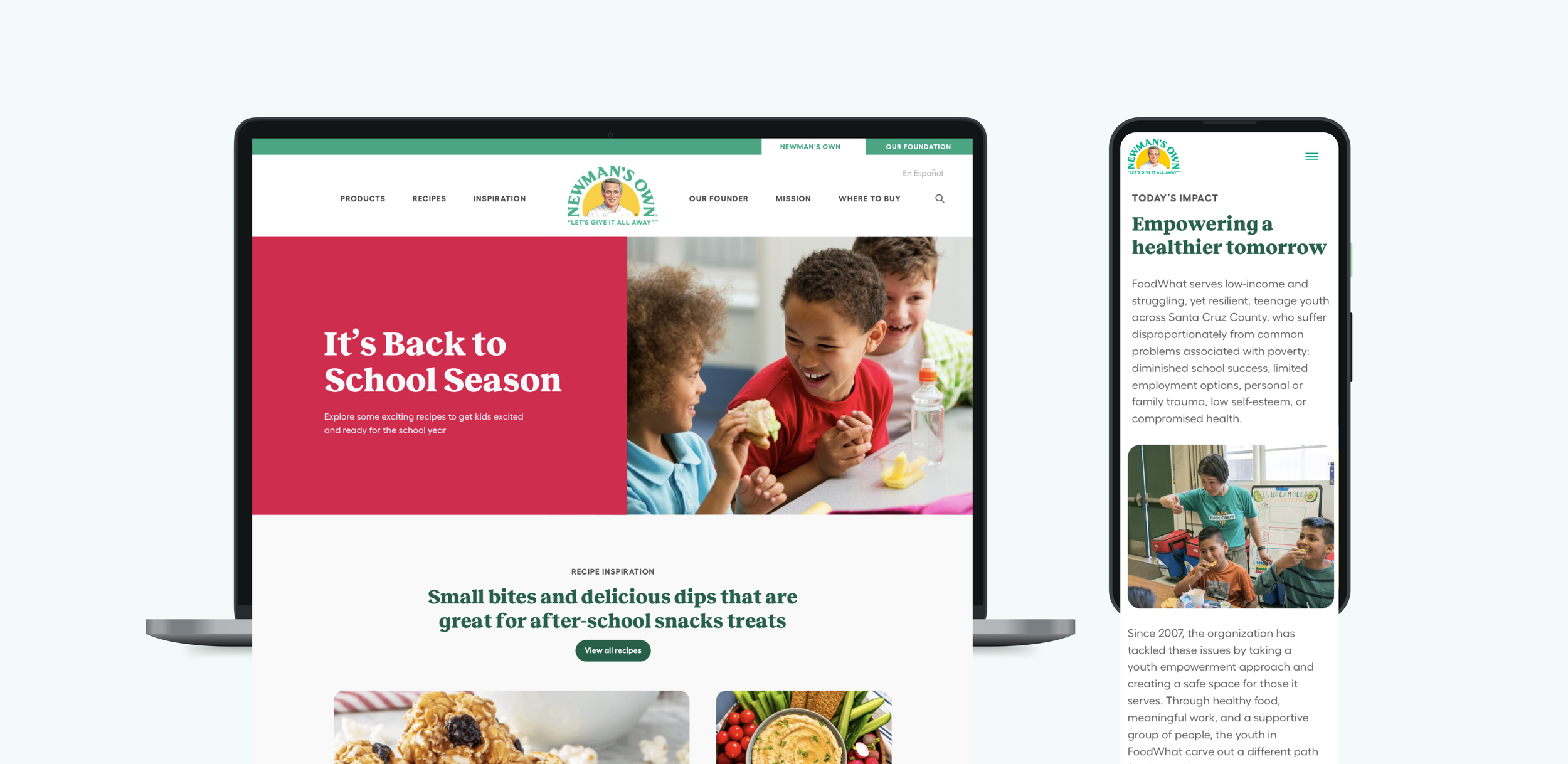
The new inspiration page gives users new thematic recipes to explore while also learning about the organizations the Foundation works with.
New pages dedicated to communicating Newman’s Own Mission: 100% Profits to Help Kids
Easy navigation leads users to discover new products and recipes
User testing/
Feedback
I owned all user testing for this project. That included developing testing goals, writing all scripts, creating prototypes, and synthesizing results into a presentation for the client with clear actionable steps/suggestions to implement feedback.
Feedback:
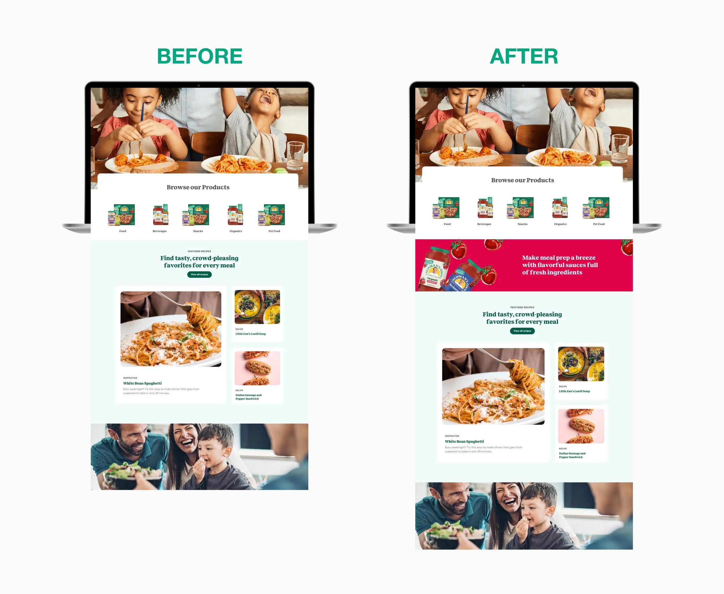
Many users commented they were not aware Newman’s Own offers products beyond salad dressings.
Design Solution:
Finding more opportunities to highlight commonly unknown products such as product banners on the homepage.
Feedback:
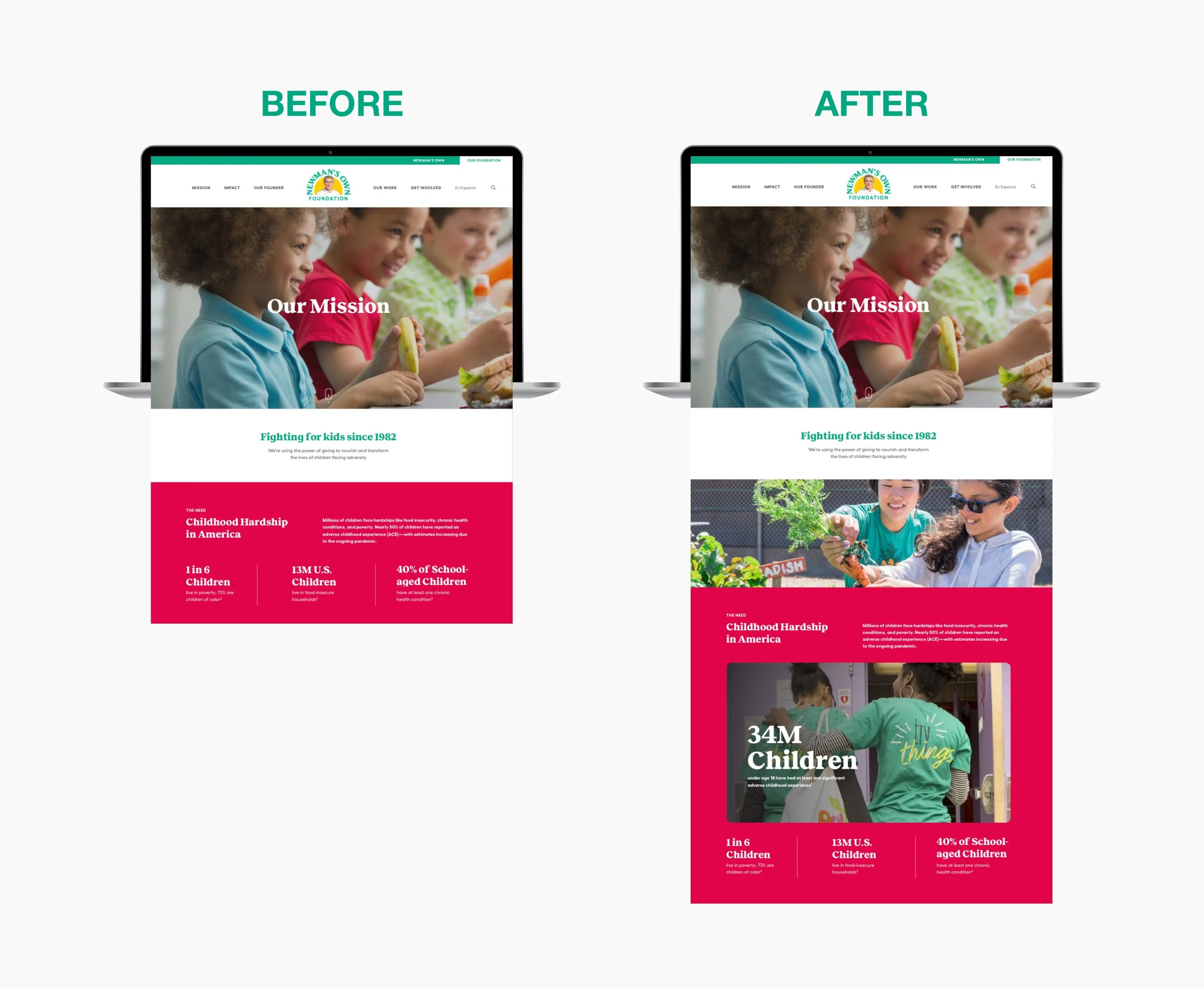
Almost all users wished there were more images of the foundation’s work on the website. “It adds a human touch”
Design Solution:
I found even more opportunities to add more images throughout the site!
Key Learnings:
Better Design Systems
Design Handoff to Development/Design Systems
The process of handing off designs to the development team is just as important as any other step! Looking back, I could have done a better job at developing a more granular design system to lead our developers. Since this project, I refined my process by providing my designs at many breakpoints and components as possible as well as having a clear design system to reference.
Thank You!
You can visit sites here: newmansown.com and newmansown.org
