Modern Meadow Visual Wayfinding System
UX Methodology Case Study & Environmental/Visual Design
The Challenge
company overview
Modern Meadow is a biotech startup. By engineering yeast cells to produce collagen, they can essentially create leather in a lab without the use of an animal. As their lead graphic designer, I was tasked with creating a wayfinding system for their new headquarters in Nutley, New Jersey.
OBJECTIVE
Create a wayfinding system that is:
Goal 1: Intuitive. The signage had to be easy to understand and navigate. Simplicity was key.
Goal 2: Malleable. New employees, departments and labs were added every quarter. I needed to create a system that could be easily updated.
Methodology
Since this was a functional design project, I utilized UX principles and design processes to guide me throughout my work.
Empathize
& Define
Define Key Users
The users of my building signage were pretty easy to identify:
Modern Meadow current employees
Modern Meadow new employees
Guests: Investors, partners, media, general contractors
Define the current process and challenge points
Our building is essentially one big triangle. Even after my signage was installed, the mantra of the building remains the same: If you just keep walking, you’ll eventually end up where you started.
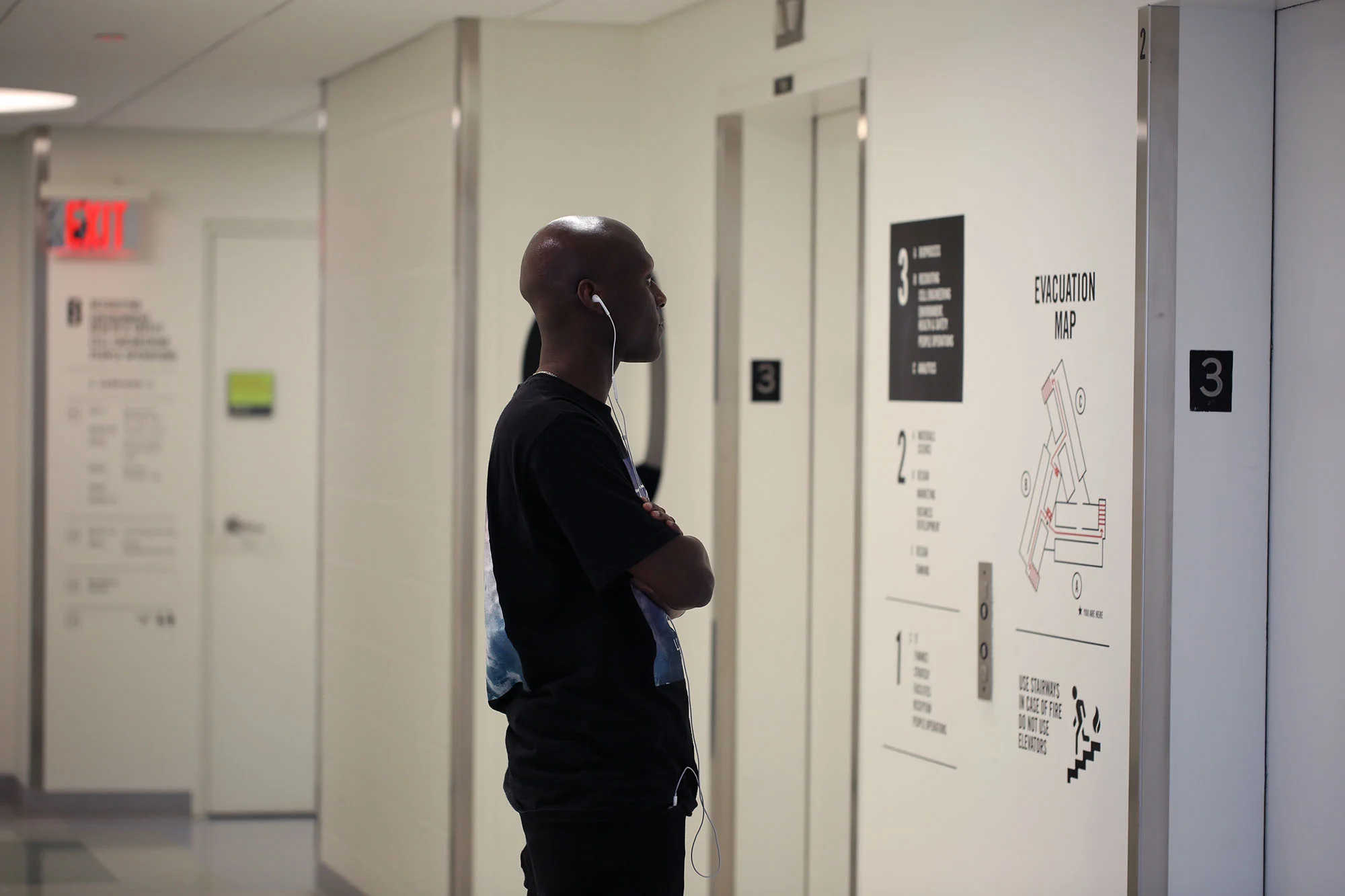
The only signage available to employees were small floorpans near the elevators. However, once you left the elevators, there was no further signage to guide you throughout the building.
CORRECTing ASSUMPTIONS
One surprising thing I learned was that current employees had just as hard of a time navigating the halls as new employees did. I always assumed that despite the lack of signage, current employees would be forced to “learn” their way around. However, that was not the case. The more conversations I had, the more I realized that people were only familiar with the particular floor that they worked on.
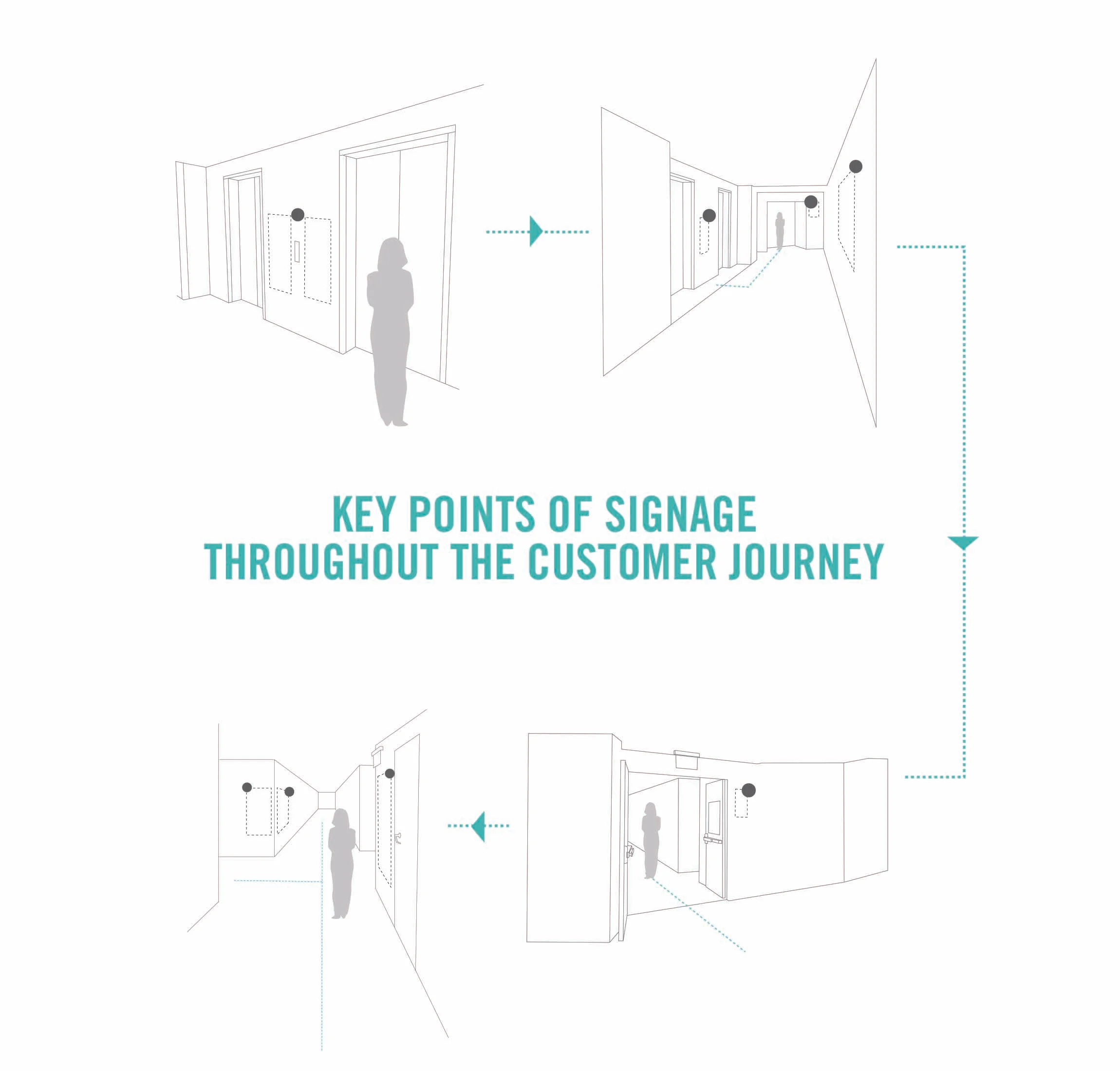
DEFINE THE CUSTOMER JOURNEY TO DETERMINE KEY POINTS OF SIGNAGE
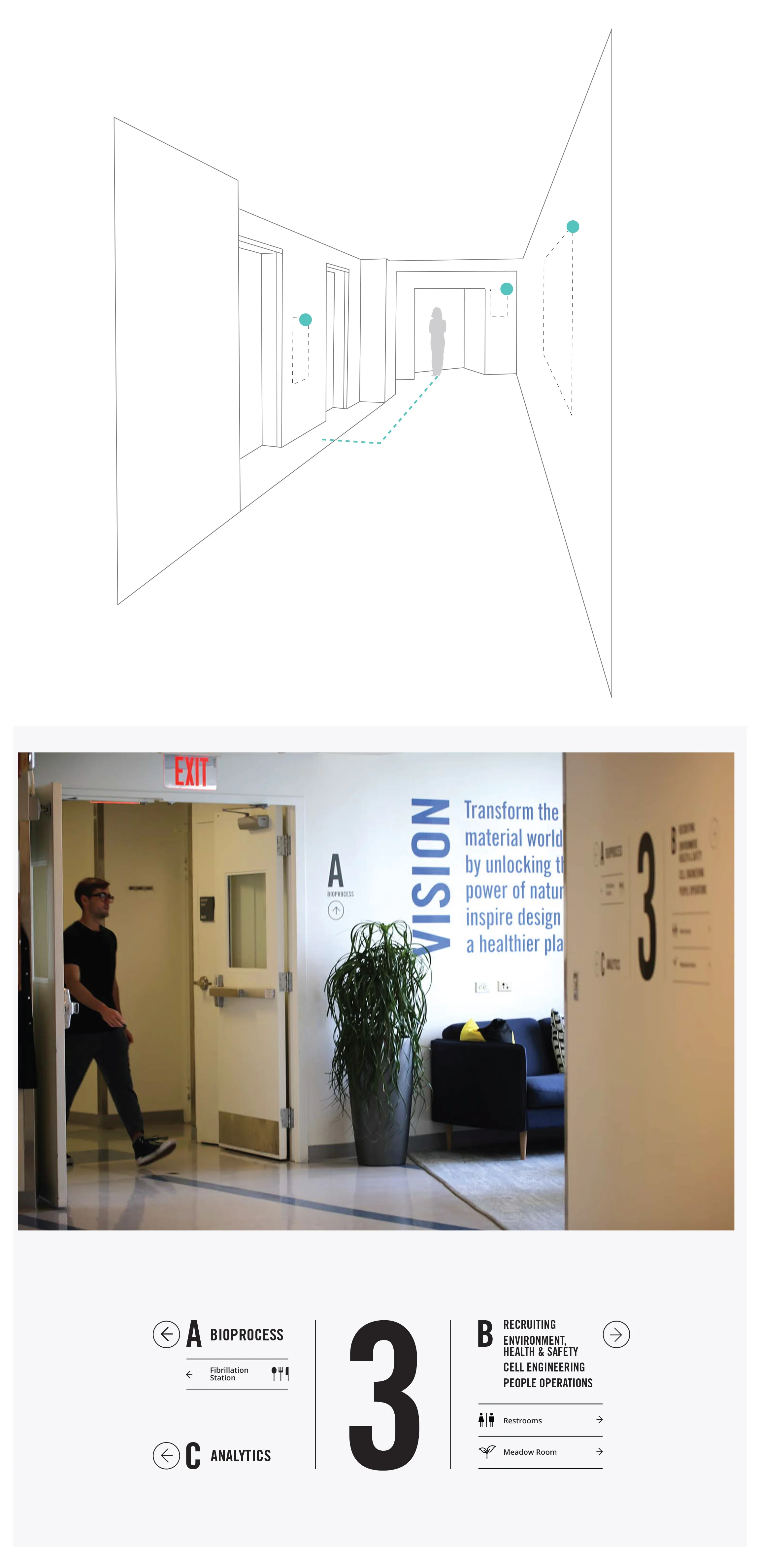
In order to decide where signage was physically needed, I initially took panorama pictures of every corridor, wall and office space. However, It was hard to capture a clear snapshot of the building with static images alone. After some brainstorming, I decided to make a video instead to better understand how people navigated the halls.
Grabbing my phone and a pad of yellow Posit-its, I headed to the third floor. As I waited for the elevator, I realized that although I know what departments are found on the third floor, a new employee may not. A key opportunity for signage! I grabbed a post it and placed it beside the elevator buttons. Once I got to the third floor, I turned left and continued my methodology.
Throughout each corridor I placed yellow post-its wherever I felt signage was needed. I then retraced my steps and filmed myself walking through this new “customer journey” of key communication points. I presented my videos to the Creative Chief Officer and together we refined my system. Again and again we walked through the halls and asked other people to walk through the halls testing our faux signage. After a few dozen rounds of this, I finally had strong key points of communication to build upon.
Design, Test
& Iterate
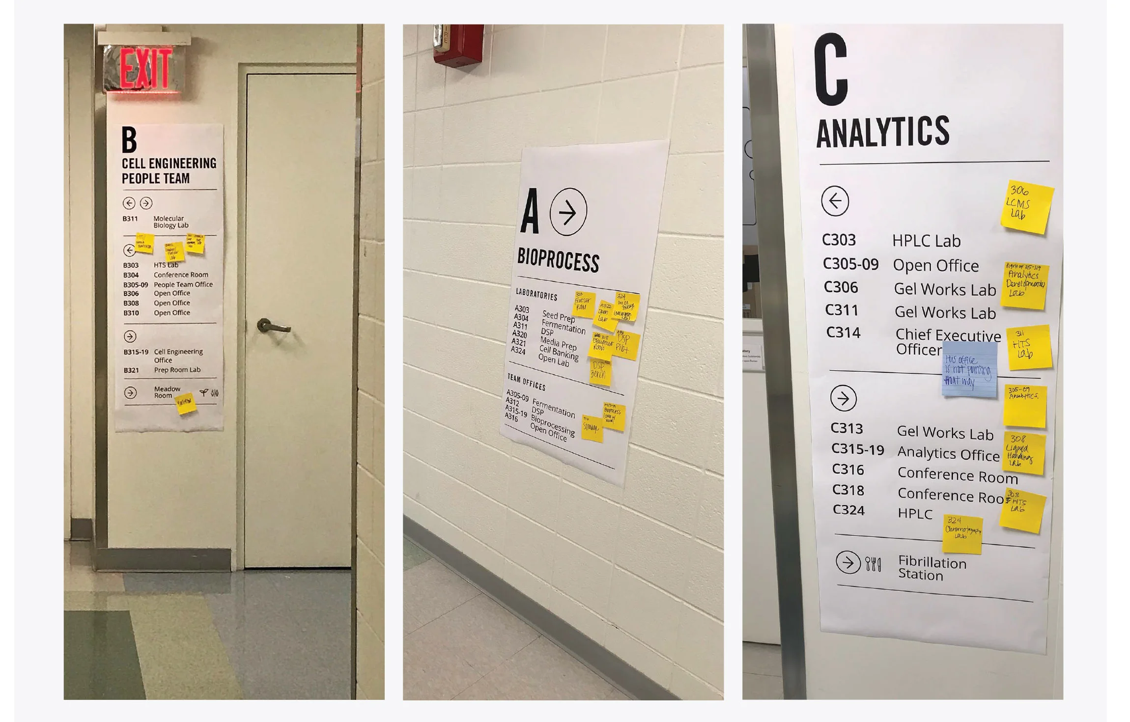
Before I committed to final production and location of the vinyls, I printed out the signage in paper-form to test out the system. The goal was to see if I had identified the right walls and at the right frequency. There was definitely a balance to strike here.
For three weeks I encouraged people to post suggestions to the signage via Post-Its. Unsurprisingly, the majority of the feedback I received were simple lab name corrections. This further supported our decision to go with a vinyl application as labs were always changing and would need to be updated frequently. However, the most constructive suggestion I received was to indicate the direction of all corridors as often as I could. For instance if you were in the C corridor, there was plenty of signage informing you how to navigate that particular corridor. However, what if you were in the C corridor and suddenly needed to know the quickest route to Corridor B? There were only a few locations where my signage accounted for that scenario. By adding additional signage indicating the direction of all corridors at any point in time, my signage felt more cohesive and seamless. After a few tweaks and a couple more rounds of tests, we were ready to go!
Final Designs
This was the fun part.
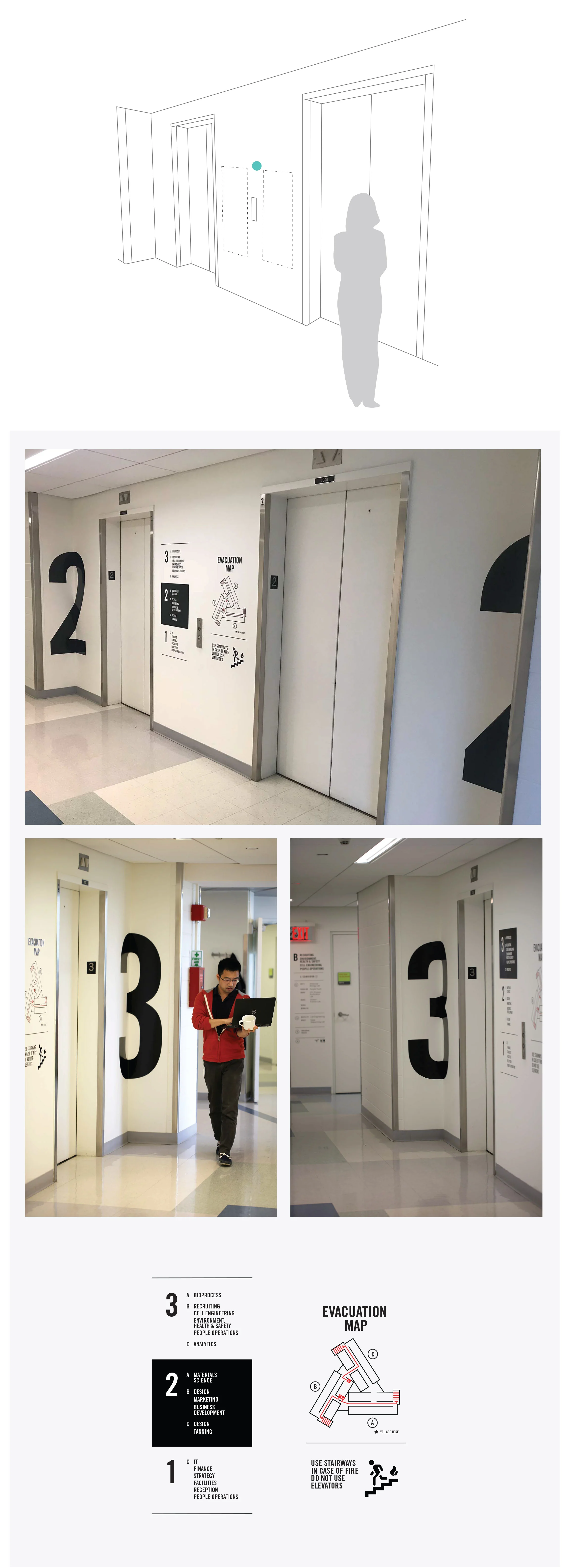
With the customer journey video as my guide, I began designing my system. However, the first decision I needed to make was the type of application. As mentioned before, the signage needed to be easily updated. To satisfy this requirement, I chose to go with a vinyl application. While I would get the majority of the signage printed by a third-party vendor, I could easily print any updates/changes in-house on our small vinyl cutting machine. This would ensure an agile, cost-effective system.
From my exploration process I knew my signage needed to include corridors, laboratories, team offices, conference rooms and common areas such as the kitchens, bathrooms, etc. I used strong fonts and hierarchy to organize all of this information.
Implement
This was the most tedious part!
Along with designing my signage, I was in charge of the entire execution/installation process. This was new to me as I had never installed vinyl decals prior to this project. I worked closely with the local printer to make sure he understood exactly how I needed my vinyls printed. Once the vinyls arrived, I got to work slowly and tediously installing all 46 pieces of signage.
Please call me a vinyl pro, because after this project, that is surely what I am.
I also supervised all the general contractors to make sure they new how and where to install the signage that required acrylic panels.
